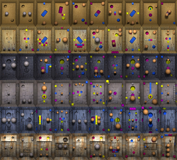
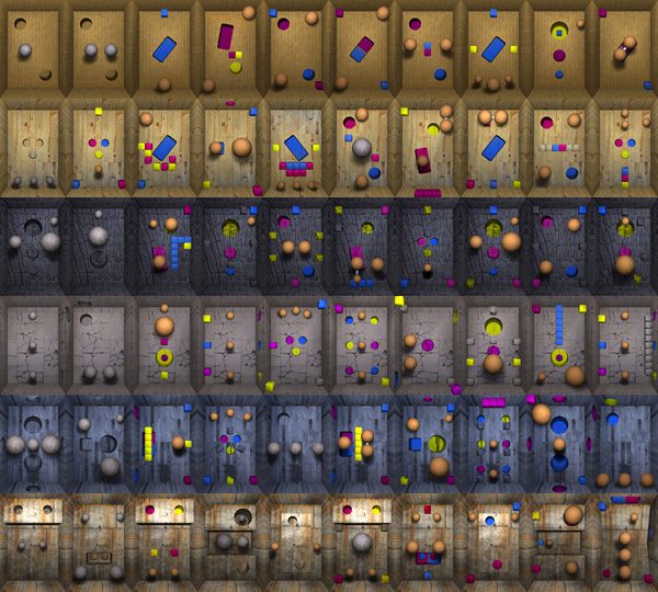
We’ve given lots of thought to the interface for FAYJU BALL, but I think there is now a solution. To use thumbnails of all the levels. This is the levels that are present in the version on the App Store, and we have ten more that have been created for the next release. Putting the levels together like this looks pretty interesting and as the levels grow and become more varied different visual combinations of the levels should look exciting. Any way here is what they look like together:

fayju ball Levels


